Handcrafted web development for agencies and entrepreneurs.
Welcome to HDC, the web dev firm that helps agency owners and ambitious entrepreneurs harness the future of the web.

5.0 | Verified Client Reviews


‘We’re not just coders. We’re fellow entrepreneurs.’
You’ve spent years building your business, honing your expertise, and putting your name on the line every time you embark on a new project. But sometimes you feel like you’re banging your head against a wall trying to find a web developer who can live up to your standards and keep up with the pace of your business.
I’m Rob Howard, the founder of HDC, and I’d like to introduce to you a new kind of web partnership. I’ve merged my background in design, advertising and journalism with more than two decades of passion and expertise in web development and tech entrepreneurship.
We focus exclusively on partnerships with high-end creative agencies and ambitious entpreneurs, delivering top-notch web development, bulletproof security and rock-solid performance on every site we build and manage.
My carefully cultivated development team and flexible, efficient business philosophy ensure that we’ll always have the bandwidth to take action on your next project – whether your deadline is next quarter or next week.
It’s time to stop hiring “coders” and hoping for the best. When you work with HDC, you’re getting more than a web developer. You’re getting a partner who’ll help you build your business and make your clients and customers proud.

Innovating online since 1999.
Serving hundreds of ecstatic agencies and entrepreneurs.

‘A breath of fresh air’
“I see the HDC team as an exemplar of a great technical partner. Our marketing specialist loves working with your team, the communication is prompt and specific, your workflows are clear and prevent mistakes, and your terms are transparent and allow us to plan. It’s such a breath of fresh air.”
Elaine Ezekiel, Director of Marketing, Atomic Object

‘No request has been too wild or crazy for them’
“HDC has been fantastic on turn-around times, and their partnership has been critical to us as we’ve evolved our agency offerings. Their willingness to help us get legacy projects across the finish line has been amazing. No request has been too wild or crazy for them!”
Toshi Rogers, Senior Vice President, Agency Fifty3
Powering 100,000+ websites.

Web Development
We craft extraordinary sites in WordPress, Laravel, React and Vue.js. From API integrations to ADA compliance, we’ll help your organization tackle your biggest web development challenges.

Branding & Design
Transform your brand’s identity or augment your in-house design team. Our designers specialize in creating stunning, user-centric websites, impactful branding, and memorable logos.

Open Source
Our open-source WordPress theme framework powers more than 100,000 sites. We’re leaders in web accessibility and contributors to a wide range of software communities.

AI Consulting
We build custom AI solutions to help our clients scale rapidly and harness the future of tech. And we train more than 100,000 budding AI pros at our education division, Innovating with AI.
Leading the industry to a better future.

Tens of thousands invested in diversifying tech
We run an industry-leading diversity grant program and work with organizations like Black Tech Pipeline, Resilient Coders and Boom KY to help members of underrepresented groups thrive in the tech industry.

A happy, healthy, high-performance workplace
We don’t do burnout. We keep up with the fast pace of business by cultivating a balanced, focused and efficient work style that ensures we’re always delivering our absolute best results.
Building for the world’s biggest brands.
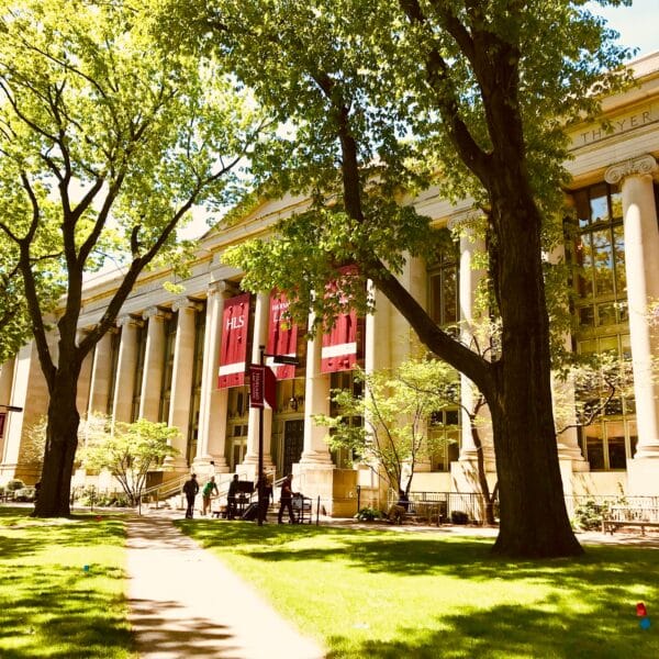
Harvard Law School

The World Bank

Emerson College Polling

Marriott International

Big Ten Fan Fest

U.S. Holocaust Memorial Museum

Denver Preschool Program